Design impact
Increased application completion rate from 35% to 75% after bringing onto Truists platform
Contributed to 41% YoY increase in lending production
Highest product application completion rate among all Truist Digital Commerce products (75% compared to 35% avg.)

New LightStream loan welcome page
The task
Prior to the "Turn Lightstream Purple" initiative in 2024, Lightstream loans were offered via a separate Lightstream "owned" application process. The application itself was clunky and outdated.

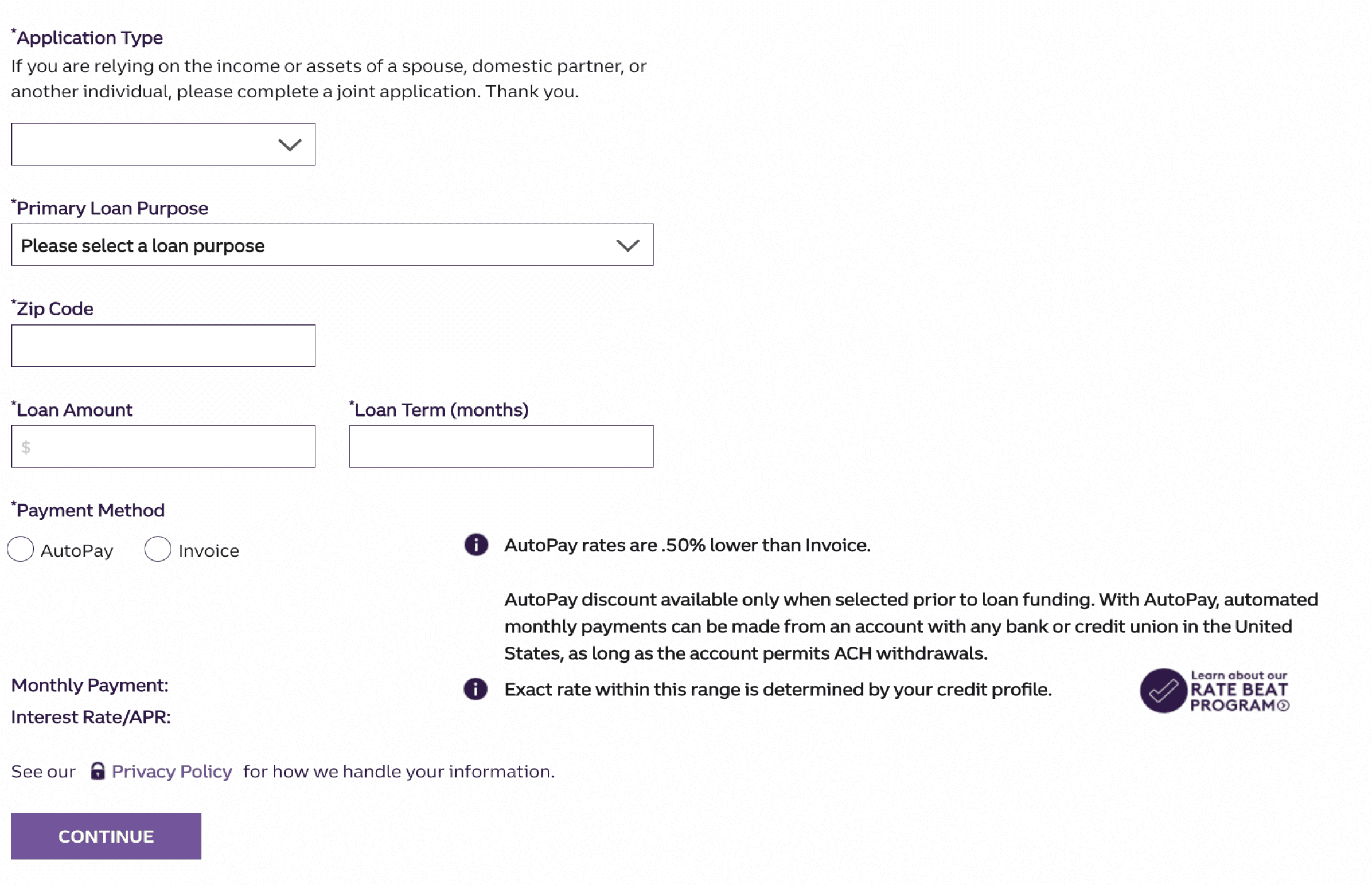
Former lightStream loan welcome page
OUR GOAL
How might we design the Lightstream loan application to be incorporated with Truists digital commerce platform and to revamp the application process to be innovative, improve the user experience and increase loan applications.
Pain points

Designing the application
MODERNIZED
SIMPLISTIC
CONVERSION
Our key considerations when designing the application from the ground up was modernization, simplistic, and to increase conversion/completion rate. It's easy for banks to fall into a bucket of "boring" or "outdated." We wanted to flip the script with this application. We wanted to make the process exciting, enjoyable, and overall, easy to navigate through.
We decided to do things differently - both from the preexisting Lightstream application, as well as what other Truist product applications look like. We wanted to guide our users through the process, make each page digestible - focusing on one item or category of information at a time.
Addressing the pain points form the pre-exisiting Lightstream by Truist application in combination with our aim for innovation, we designed through rounds of iterations, increased project requirements, and balanced design with business goals to develop Truists Lightstream, as we see it today


Ask the people
During the design for the initial launch for Lightstream on Truist.com, our research partner conducted 2 rounds of qualitative research. Talking to real people whom were familiar with the loan application process, we prepared two fully working prototypes with the aim of understanding how our clients felt about the proposed application.
Between research readouts, and sitting in on research sessions, we took back real data to improve our designs and create a product optimized for both new, and preexisting Truist clients.
"Very user friendly...I like it...Big... Bold...Gives you what you are looking for without extraneous information."
- Participant 2, in regards to the loan calculator cards